
Accelerate: Designing an Enterprise Payment Platform from the Ground Up
Accelerate is iRecharge's enterprise payment platform, built to give businesses a professional-grade tool for collecting payments, managing branches and users, and integrating a payment gateway into their own products. This case study covers building a complete design system from scratch, designing complex financial flows, and crossing over to lead the frontend engineering team that shipped and certified the product.
01
Origin: Born from iRecharge
Accelerate did not start as a new product pitch. It started as a pressure point inside iRecharge. As I rebuilt the consumer iRecharge platform, it became increasingly obvious that the B2B side of the business was being held back by sharing a product with retail users. Corporate clients, API merchants, and businesses using iRecharge to power their utility payment infrastructure needed a completely different kind of experience. They needed dashboards, not checkout flows. Branch hierarchies and role management, not individual service purchases. The product split was inevitable.
When leadership decided to carve out the enterprise side as a standalone platform, Accelerate was born. The concept was a payment solution that competes directly with the likes of Paystack and Flutterwave, but built with the DNA of a utility payment company: deep into collections, settlements, and API infrastructure. It would serve merchants, businesses, and institutional clients who needed to collect payments, send payment links, manage teams across multiple locations, and integrate a payment gateway directly into their own applications.
My task was to design it from absolute zero. No existing component library. No brand guidelines. No previous screens to reference or iterate on. Just a product brief, a development team that had never worked with a designer at this level of involvement, and a blank Figma file.
02
Understanding the Users
Before wireframing anything, I needed to understand exactly who would be sitting in front of this product and what they each cared about. Payment platforms are unusual because the stakes for every user type are high. Getting this wrong does not just mean a poor experience. It means money going missing, transactions failing, or a business losing trust in the platform entirely.
Three distinct personas emerged from stakeholder interviews and analysis of how iRecharge's existing B2B clients operated:
- Chidi, the Business Owner: Runs a chain of retail outlets and doesn't process transactions himself, but needs high-level visibility at all times: total collections today, which branches are active, whether settlements arrived on schedule. He logs in a few times a week but needs the dashboard to surface something meaningful the moment it loads. Ambiguity in the numbers makes him anxious, and he has no patience for digging through menus to find a summary.
- Amara, the Finance Manager: Lives inside the platform daily. Her world is reconciliation: matching collection totals against settlement records, tracking which transactions are still sitting in the collection wallet versus what has cleared to profit, and making sure the T+1 settlement cycle is running cleanly. She needs reliable data tables, precise filters, and exports that don't require reformatting before she can use them.
- Emeka, the Integration Developer: Never really uses the dashboard. His experience of the product is entirely through the SDK and API documentation. His frustration with most payment platforms is inconsistency: endpoints that behave differently in sandbox versus production, webhook payloads that change without notice, and docs written by someone who already knew all the answers. He needs clarity, predictability, and a sandbox that mirrors production closely enough to trust.
Designing for Chidi, Amara, and Emeka simultaneously meant building three different mental models into one coherent product. The navigation structure, information hierarchy, and dashboard defaults all had to be calibrated so each user type lands somewhere immediately useful.
03
Building the Design System from Scratch
I started with the visual language before touching a single layout screen. Typography scale, colour palette, elevation and shadow system, spacing tokens, border radius conventions: these decisions had to be made deliberately and documented clearly before any component was built, because every component would inherit them. Getting the foundation wrong meant fixing it later across hundreds of screens.
The component build followed atomic design principles: base elements first (buttons, inputs, badges, icons), then composite components (form fields with validation states, table rows with actions, status indicators), then full patterns (data tables, modal stacks, navigation shells, payment confirmation flows). Every component was documented with all of its states: default, hover, focused, disabled, error, loading. Fintech interfaces live and die by their edge cases, and a design system that only handles the happy path is not a design system.
The other half of building the design system was not the components but teaching the development team how to use them. Most engineers on the team had never worked with a structured component library rather than a stack of static screens. I ran working sessions to walk through how to read component specs, interpret spacing tokens, and flag when an edge case was not covered rather than inventing a solution that drifted from the design intent. That alignment investment paid off consistently for the rest of the project.
A design system is not a deliverable. It is an ongoing agreement between design and engineering about what the product looks like and how it behaves. The documentation matters as much as the components.
04
Designing the Core Flows
I started every major flow with low-fidelity wireframes before moving into Figma. The goal at the wireframe stage was structure and logic, not visual polish. For financial flows, it is easy to fall into the trap of building beautiful screens that are logically broken. A merchant who cannot clearly understand why their settlement is delayed, or which wallet a transaction landed in, does not care how good the empty state illustration looks.
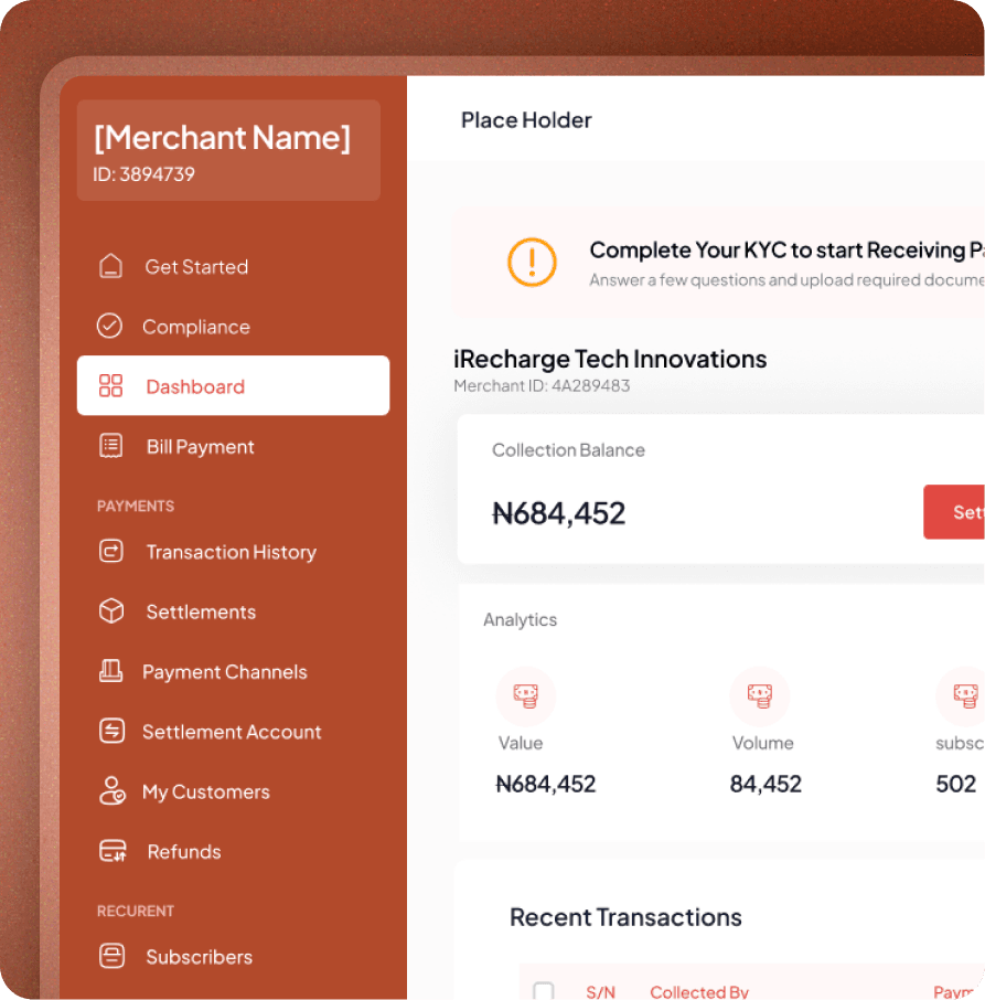
The wallet architecture was the most conceptually demanding design problem on the project. Accelerate operates three distinct wallets, each with a specific role in the money lifecycle, and merchants needed to understand the distinction without having to read documentation. The collection wallet holds all inbound funds the moment they arrive, regardless of channel. The profit wallet reflects actual earnings after platform fees are deducted. Settlements are the periodic payouts Accelerate initiates to the merchant's external bank account on a T+1 cycle: funds received today are transferred the next business day. Making this mental model legible in a dashboard required careful labelling, clear visual separation between wallet types, and transaction-level drill-downs that showed exactly how money moved between them.
- Merchant onboarding: Business profile creation, document verification, wallet activation, and first branch setup. Designed to be completable in a single session with a persistent progress indicator and the ability to save and resume at any point.
- Branch and user management: Merchants create branches representing physical locations or operational units. Each branch has its own set of users with scoped role permissions. The hierarchy flows cleanly: merchant account at the top, branches below it, and users within each branch with access only to what their role permits.
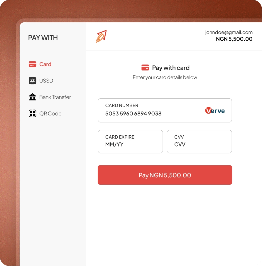
- Payment collection: Three collection paths unified in one interface: receiving via the integrated gateway (card, bank transfer, USSD), generating and sharing a payment link, and API-triggered collections for merchants using Accelerate as infrastructure. All three routes land in the same collection wallet and surface in the same transaction ledger.
- Settlement and T+1 payout: Amara's daily flow: review collection totals, confirm profit wallet balance after fees, initiate settlement. Funds are disbursed to the registered bank account the following business day. The UI surfaces the exact settlement schedule so there is never ambiguity about when money will arrive.
- Payment gateway and SDK: For Emeka's integration experience, the design extended beyond the dashboard into the developer documentation surface: a clear API reference, a sandbox environment with realistic test data, and an SDK that mirrors production closely enough that going live requires minimal rework.
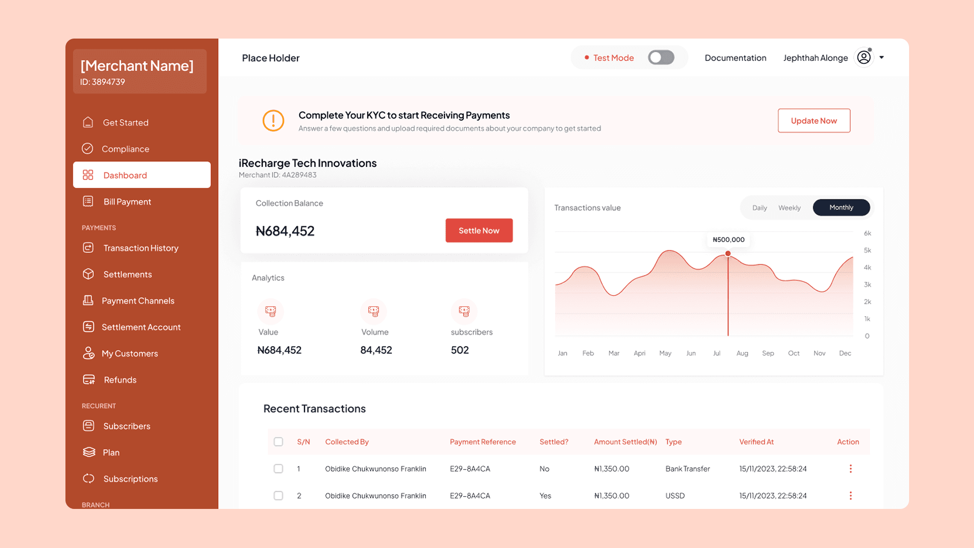
Merchant dashboard — collections, profit wallet, and settlement overview.
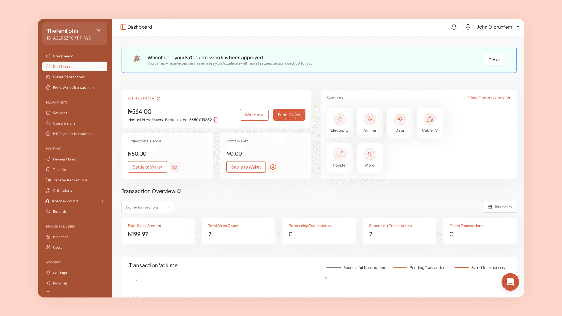
Transaction ledger and wallet drill-down views.
05
When the Designer Becomes the Engineer
Once the design system reached a stable, well-documented state, my role began to shift. I had been writing detailed component specs and running implementation reviews, but there were still persistent gaps between what was designed and what was being shipped. The most efficient way to close that gap was to step into the codebase directly. I started the design-to-code conversion myself, building out the component library in code to match the Figma system precisely. What started as spearheading the UX engineering effort gradually became leading it.
By the time the platform reached production readiness, I had transitioned fully into the lead frontend engineering role, handling all integrations, running code reviews, and making architectural decisions on the frontend layer. The shift made sense because I held both the design intent and the implementation constraints in a way nobody else on the team did. The decisions I had made months earlier in Figma were now decisions I was responsible for executing correctly in code.
The most significant challenge I took on as engineer was the PCIDSS certification. PCI DSS (Payment Card Industry Data Security Standard) is the compliance framework any platform handling card payment data must pass before going live. It is rigorous, technical, and unforgiving. I led the entire certification effort on the frontend: auditing every component that touched payment data, implementing the required security controls, ensuring data transmission met encryption standards, and working through the formal assessment process with the compliance team. We passed. Accelerate launched as a certified payment platform, which is not a given for startups in this space, and it is the outcome I am most proud of from this entire project.
Crossing from designer to engineer on the same product gave me a perspective very few people in either discipline have. Every design decision I had made, I had to live with in code. It made me a more precise designer and a more empathetic engineer, and it is the reason I believe the gap between design and engineering is ultimately a people problem, not a process one.
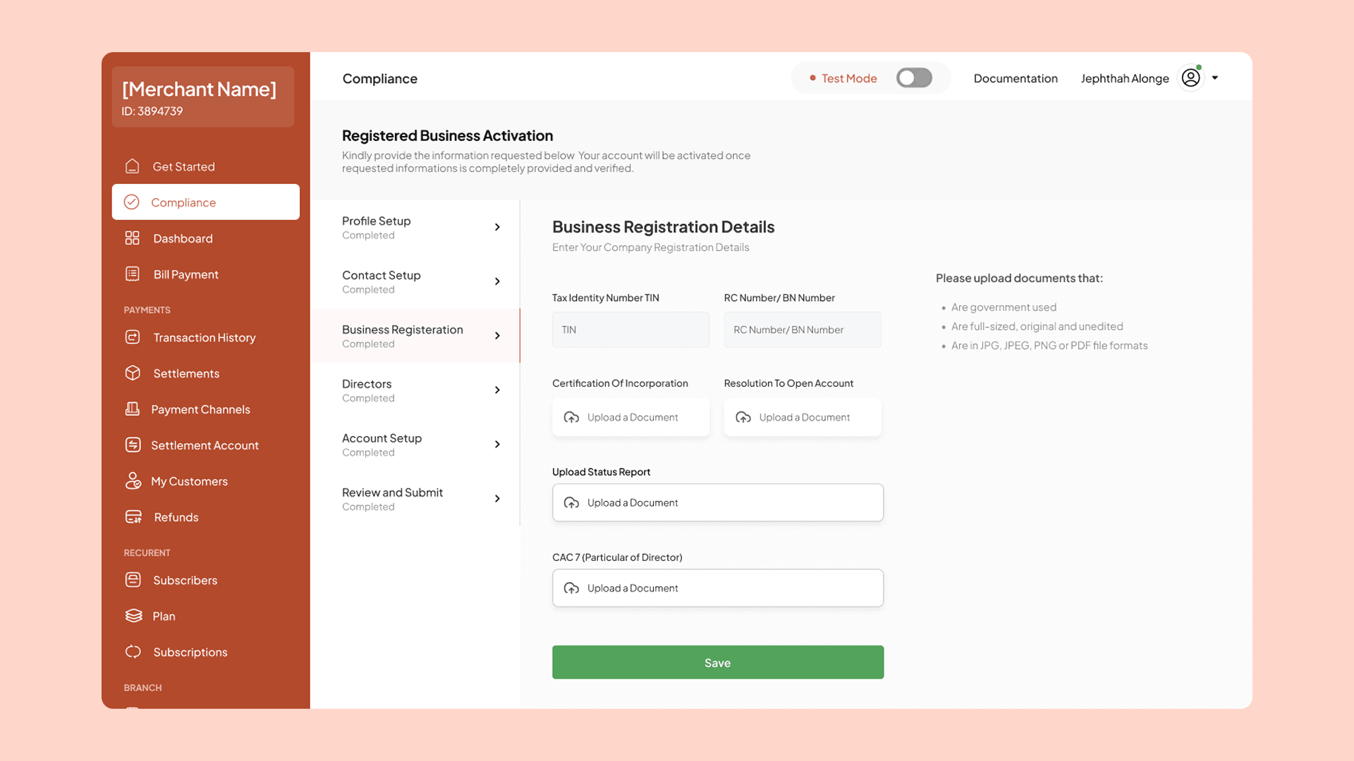
PCIDSS compliance flow — mapping every component that touched payment data through the certification audit.