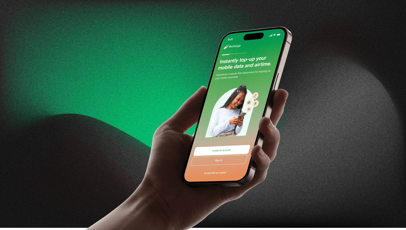
iRecharge: Redesigning Nigeria's Largest Utility Platform
iRecharge is Nigeria's largest electricity distributor and API provider. When I joined in 2021 as their first-ever UX designer, the platform had been built entirely by developers on a PHP Laravel template with no design input, no visual hierarchy, and a user experience so poor that customers were choosing competitors despite iRecharge powering most of the country's utility payments behind the scenes. This is the story of how I audited, redesigned, and rebuilt the experience from scratch.
01
Background: Nigeria's Utility Backbone
iRecharge is Nigeria's largest electricity service and API distributor. As a super-merchant with direct integrations to the major DisCos (the Distribution Companies that control the power grid), they power the utility payment infrastructure for banks, malls, manufacturing companies, and a nationwide network of smaller retailers who buy wholesale and resell.
To serve everyone under one roof, iRecharge built a single web and mobile platform: a consumer paying their monthly electricity bill sat alongside a corporate client buying power in bulk, and a retailer managing a sub-merchant network. The underlying engine was highly profitable, particularly through API integrations with large enterprises. But the end-user experience was a completely different story.
The apps had been built entirely by developers using a PHP Laravel template. There was no design involvement, no visual hierarchy, no thought given to how a real person would navigate the product. Users left frustrated, dropped bad reviews on the App Store, and complained on social media. Because the experience was so poor, customers who could choose were quietly switching to competitors. In April 2021, iRecharge brought me on as their first-ever UX designer to fix it.
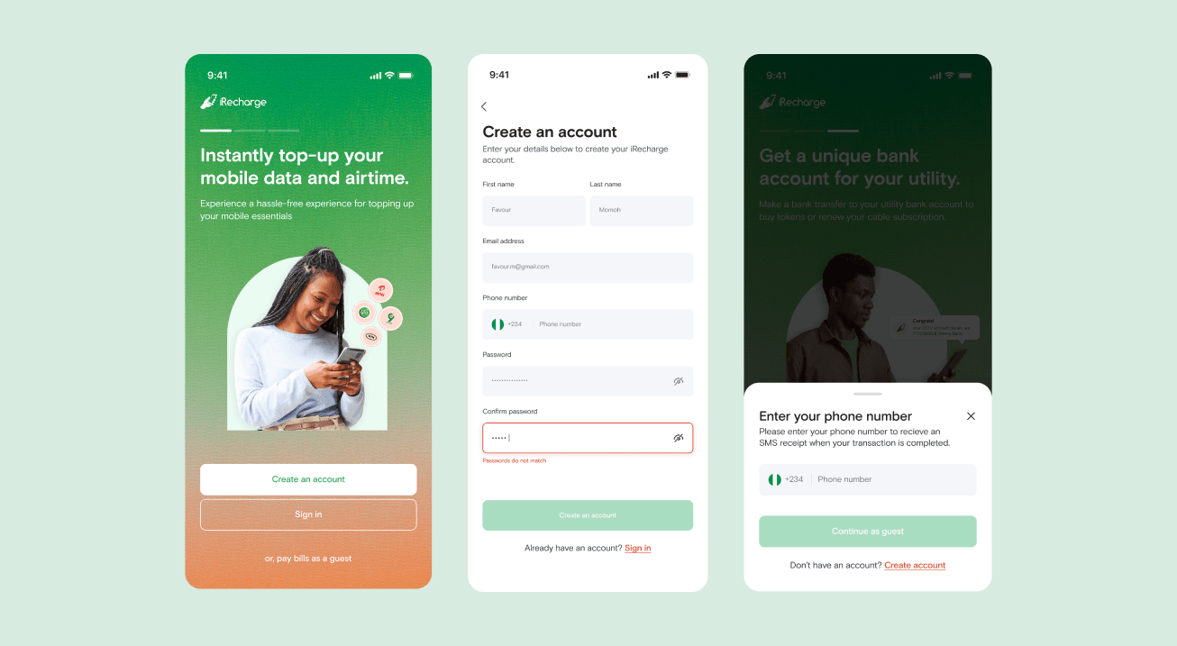
Redesigned mobile onboarding flow.
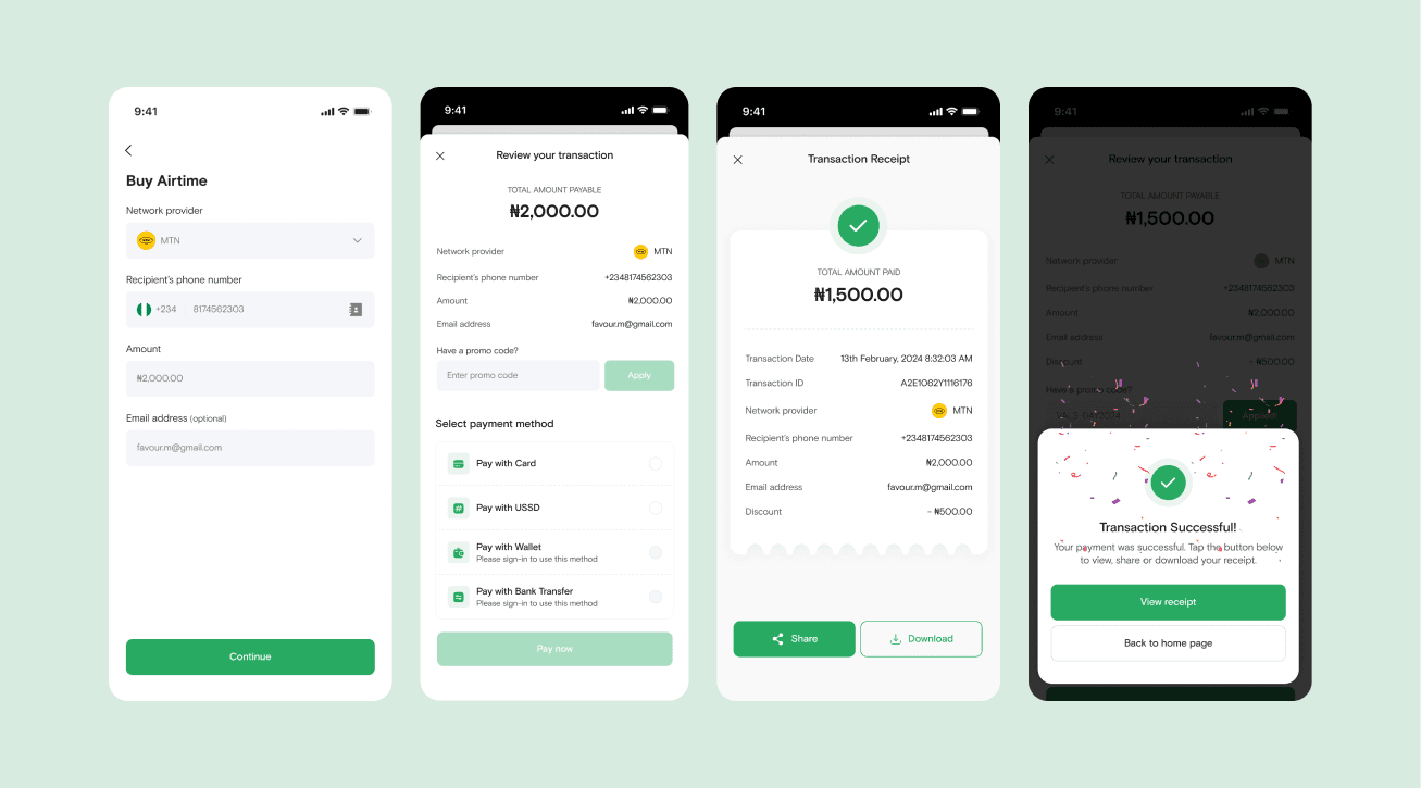
Redesigned purchase and service flow on mobile.
02
Unraveling the Chaos: The Research Phase
My first weeks were not spent in Figma. They were spent becoming a power user of every single feature the platform had, because you can't redesign something you don't fully understand.
The product was enormous. iRecharge supported buying airtime, data, and electricity, individually and in bulk. Users could schedule recurring transactions, manage a wallet, fund it, withdraw from it, and transfer money. Merchants had an entirely separate layer on top: creating branches, adding sub-users with role controls, receiving payments, and sending payment links. It was a full financial ecosystem crammed into a single interface, with no clear distinction between the two audiences.
I went through every page on both the web and mobile apps, screenshotted everything, and mapped it all out by flow. Since FigJam didn't exist yet, I built the user flows in StarUML, a diagramming tool that was far from elegant but surprisingly effective for mapping complex journeys. Alongside the mapping, I ran constant alignment sessions with stakeholders to understand the business intent behind features that seemed unclear or redundant. Some things I thought were bugs turned out to be intentional. Some things I assumed were intentional were definitely bugs.
03
The Four Core Problems
Once I had a complete picture of the product, I needed data to back up what I was seeing. I partnered with the growth team to pull conversion rates, average task completion times, and drop-off points from the analytics tool. I reviewed every App Store and Play Store comment I could find. I ran a System Usability Scale (SUS) study and conducted a thorough heuristic evaluation across both platforms.
The data confirmed the obvious and surfaced a few things I hadn't expected. Four structural problems kept appearing regardless of which method I used:
- Broken brand identity: Developers had applied colours inconsistently across every screen. Buttons were different shades on different pages. Cards used conflicting palettes. Nothing felt intentional or coherent. It looked like several different products had been stitched together.
- Ignored design fundamentals: Alignment, spacing, visual hierarchy, and layout had been applied arbitrarily. Pages were visually noisy. Critical information was buried. Things that shouldn't have been prominent were front and centre.
- Navigational paralysis: Users consistently got lost trying to find basic features. The information architecture didn't reflect how people actually thought about tasks like paying a bill or managing a wallet.
- Silent, cryptic errors: When background processes failed (and they often did), the system returned technical error strings. Users didn't know whether to retry, contact support, or assume their payment went through. This was especially damaging for a financial product.
The most surprising finding wasn't that the experience was bad. It was that users were still coming back, because for many transactions there was simply no better option. We were sitting on enormous untapped retention potential.
04
Ideation: Wireframes, Branding, and Building for the Future
I started the design work with low-fidelity wireframes, not high-fidelity screens. The core flows, including the homepage, service discovery pages, and the transaction funnel, needed structural solutions before they needed visual polish. I ran usability tests on paper prototypes, iterated based on where users hesitated, and kept stakeholders aligned throughout.
Once the structural foundations were stable, I brought in the growth team, brand designers, and the engineering lead to rebuild the brand identity from scratch. We aligned on a visual language that felt trustworthy, clear, and unmistakably iRecharge.
During this phase, something significant was happening in the background: leadership had started discussing a product split, separating the B2B and B2C experiences into two distinct platforms. The technical foundation for this was already being engineered.
Knowing that split was coming changed how I approached everything. Instead of designing isolated screens, I invested heavily in building and documenting a comprehensive design system. Every component was built to scale. Typography tokens, colour variables, spacing scales, icon sets, all documented so that when the products diverged, we wouldn't be starting from zero. We'd be forking from a solid, shared foundation.
High-fidelity onboarding screens from the Figma design system.
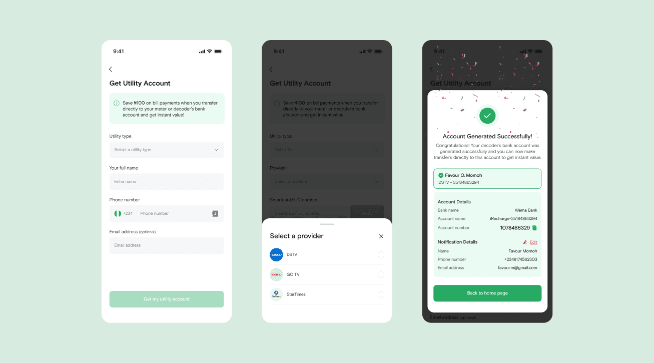
Design system component library — documented across all states.
Redesigned purchase service flow — final high-fidelity screens.
05
Build, Handoff & The 1Bank Feature
After completing the designs, I ran a series of workshops with the frontend engineering team. I walked them through the design library, taught them how to read spacing tokens and component states, and established a QA workflow to catch deviations between design intent and shipped code. The goal wasn't just to hand over files. It was to build shared understanding so engineers could make good judgment calls when edge cases came up.
While the new experience was being built, we also introduced a significant new feature: 1Bank Transfer. This let users generate a dedicated bank account number that could be linked to recurring utility bills (electricity, TV subscriptions, and others) so payments happened automatically without requiring a manual login each time. It was a major convenience improvement that directly addressed one of the most common user complaints.
Immediately after launch, we integrated Hotjar and Smartlook to monitor real user sessions. Watching people interact with the redesigned flows for the first time was both gratifying and instructive. We saw where the new design worked exactly as intended, and we caught a handful of friction points we iterated on quickly in the weeks that followed.
The 1Bank Transfer feature — users generate a dedicated account number linked to recurring utility bills.
06
Impact: The Numbers and What Came Next
The results were significant. Retention climbed to 70%. Conversion rate grew by over 200%. The redesign didn't just improve how the product looked. It made the business case for design undeniable.
With the product split now underway, the enterprise B2B platform launched as Accelerate, which you can read about in its own case study. The consumer iRecharge app continued to evolve on its own track. The design system built during this project became the shared foundation for both.
It was also clear I couldn't scale this ecosystem alone. Working directly with HR, I helped define the design roles we needed and gradually onboarded ten additional designers to the team. My role shifted from sole individual contributor to design lead, managing the team, maintaining the design system, and overseeing quality across both products.
The most important lesson wasn't about screens or interactions. It was about building systems. Investing in documentation early, even when you're a team of one, creates the infrastructure that lets you move fast when the business decides to scale, pivot, or split into something bigger.