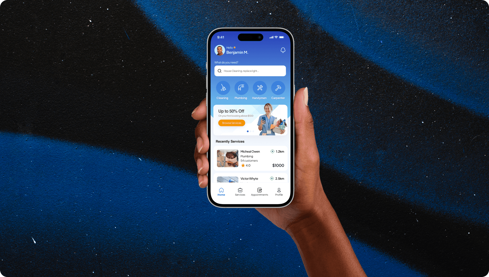
Sewa Service Providers Marketplace and Freelance Mobile Application
Sewa is a mobile-first marketplace connecting users to skilled handymen, cleaners, and local workers close to them. The design challenge was building a two-sided platform trustworthy enough for users to invite strangers into their homes, while being simple enough that a busy professional could book a service in under two minutes.
01
The Problem Worth Solving
It is a Sunday afternoon. Your kitchen sink starts leaking. You don't need a full renovation, just someone who knows what they're doing to show up in the next hour or two. You open your phone, search for a plumber, and land on a list of businesses with no reviews, outdated numbers, and zero indication of whether anyone is actually available or how far away they are.
This is the everyday friction Sewa was built to eliminate. Not just for plumbing emergencies, but for the entire category of local services that people need reliably and quickly: cleaning, electrical work, carpentry, car repairs, and the dozens of small fixes that fall through the cracks of every existing platform.
The idea was straightforward on paper: a mobile marketplace that connects users to verified service providers based on their location. In practice, building something people would actually trust enough to invite strangers into their homes turned out to be a much more nuanced design problem than the brief suggested.
02
Who We Were Designing For
Before we opened Figma, we needed to understand the two very different groups of people this app had to serve simultaneously: the users hiring services, and the providers offering them. A marketplace only works when it works for everyone on it, so getting both sides right was the first real design challenge.
On the user side, we built out personas grounded in research interviews. The first was Keisha, a busy marketing manager in her early thirties. She came home one evening to find her kitchen sink leaking badly. She needed a trusted plumber immediately but had no idea where to find one quickly. Her priorities were speed, trust, and visibility into pricing before she committed to booking. The second was Jamal, a sales rep in his forties who drives constantly for work. When his car broke down on the way to a client meeting, stranded on a busy road, his only goal was to locate a reliable mechanic within minutes. Both personas shared the same core anxiety: a time-pressured situation, a stranger who needed to be trusted fast, and no obvious platform that made that easy.
On the provider side, the challenge was different. Freelance service workers needed a platform that delivered consistent, verified job requests rather than the irregular word-of-mouth work they were used to. The app had to feel credible and professional enough for them to commit their income to it.
- Busy Professionals: Time-poor users who need quick, reliable services without the friction of negotiating availability or pricing on the fly.
- Households and Businesses: Users with recurring needs like cleaning, electrical work, and repairs who want a dependable platform they can return to with confidence.
- Freelance Service Providers: The supply side of the marketplace: skilled workers who need a steady stream of verified, fairly priced job requests to replace inconsistent word-of-mouth income.
03
Three Core Design Challenges
With a clear picture of our users, we mapped the friction points that existing solutions had consistently failed to resolve. Three problems kept surfacing regardless of which persona or use case we examined:
- Proximity: Most competing apps matched users to providers based on availability alone, not location. The result was long wait times and disappointed users who expected someone nearby and got someone forty minutes away. For Sewa to feel genuinely different, location had to be the primary organizing principle of the entire experience.
- Trust: The biggest barrier to adoption in this category is psychological. Hiring a stranger to come into your home, fix your car, or handle your property requires a level of confidence that most platforms don't work hard enough to earn. Verified profiles, transparent ratings, and secure in-app payments were not nice-to-haves. They were the foundation the entire product had to be built on.
- Ease of Use: Complex interfaces hurt both sides of the marketplace equally. Users who have to hunt for a booking button will leave. Providers who can't manage their availability without confusion will disengage. The interaction model had to be so intuitive it felt borrowed from an app people already used every day.
Users weren't just hiring a service. They were making a trust decision in a moment of stress or urgency. Every design choice had to reduce anxiety, not add to it.
04
The Solution: Location, Trust, and Simplicity
Our goal was to design a location-first marketplace that resolved all three challenges through deliberate, interconnected features rather than isolated fixes. The platform needed to feel fast, feel safe, and feel familiar. Not ambitious for its own sake, but precise in a way that actually solves the problem.
We organized the core features around what users told us mattered most: building enough trust to take the leap, and making the experience frictionless once they did.
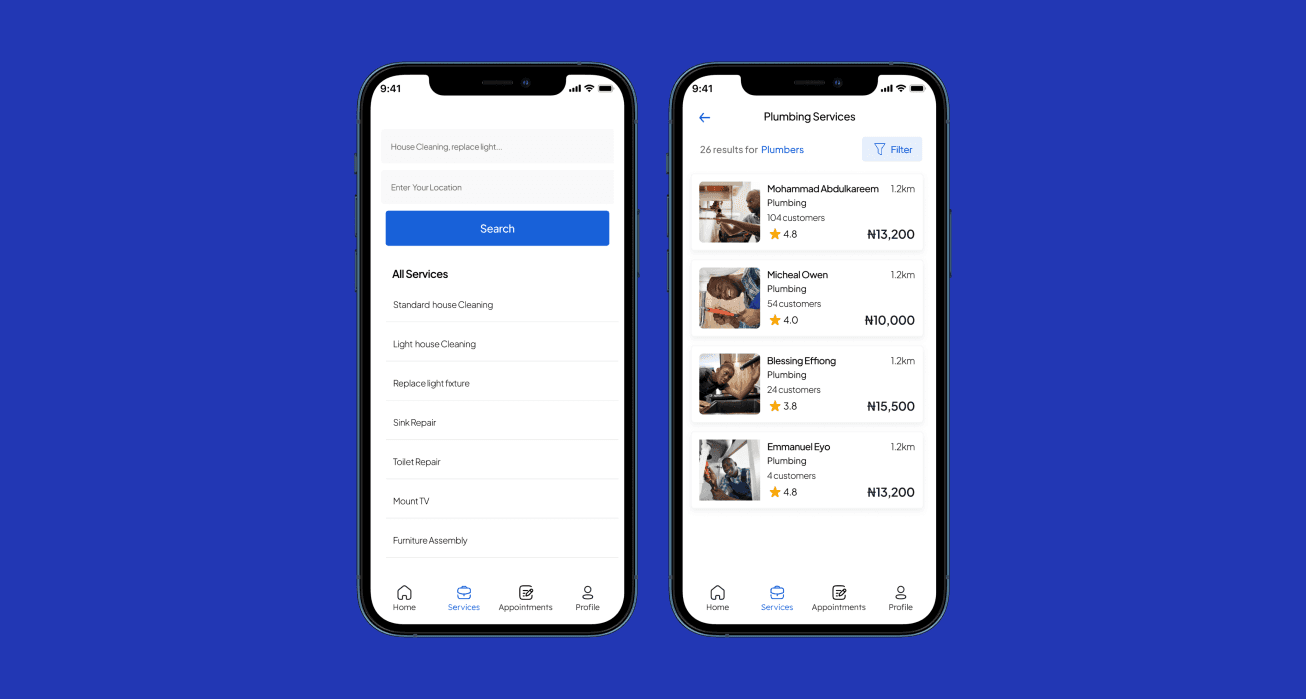
- Geolocation-First Matching: The app automatically surfaces the nearest available providers first. Users see exactly how far away each provider is before they commit to booking, eliminating the proximity guesswork that frustrated users on every competing platform.
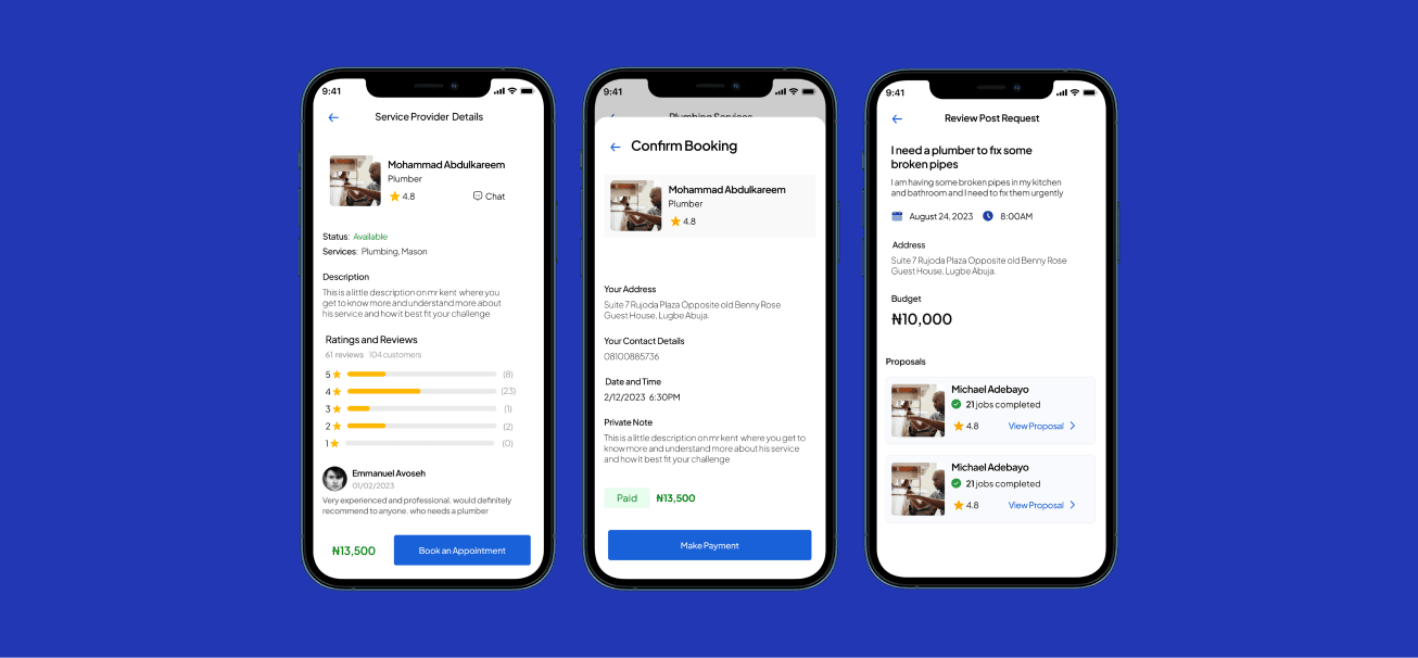
- Profile Verification: Service providers must verify their identity and qualifications before their profile becomes visible to users. No anonymous listings, no unvetted strangers.
- Secure In-App Payments: All transactions are handled within the app, removing the ambiguity of cash and creating a transparent record for both parties. This single decision removed one of the biggest trust blockers identified in user interviews.
- Ratings and Reviews: After every completed job, both sides can leave feedback. The rating system creates a self-regulating marketplace where quality providers rise naturally and accountability is built into the experience.
- In-App Chat: A secure, built-in communication channel lets users and providers finalize job details, share location, and clarify scope without exchanging personal contact information prematurely.
- Real-Time Notifications: Booking confirmations, provider arrival updates, payment receipts, and status changes are surfaced immediately. Users are never left wondering what is happening with their request.
05
From Wireframes to Final Mockups
We started with low-fidelity wireframes, not screens. The core flows needed structural solutions before they needed visual polish: how does a user browse service categories, select a provider, and confirm a booking in as few steps as possible? We mapped the full user journey end to end, from opening the app to receiving a completed service, and identified every decision point where we could reduce friction.
For navigation, we borrowed familiar patterns from ride-hailing apps. Users already knew how to request a driver nearby, see their arrival time, and track them in real time. Applying that same mental model to service bookings made the app feel immediately legible without a learning curve. The visual language followed suit: a clean, minimalist layout with bold action buttons, calming tones to reinforce trust and reliability, and clearly labelled service categories represented by recognizable icons.
After multiple iterations on the wireframes, we moved into high-fidelity prototypes and ran usability testing sessions. The testing revealed a handful of flows where users hesitated or took an unexpected path. We iterated on those specific moments until the journey felt natural. The final mockups reflected every insight gathered along the way: a product that looked polished, but had been shaped entirely by real user behaviour.
06
Impact and Results
The launch results were a strong validation of the design decisions made throughout the project. The metrics reflected not just an attractive interface, but a product that had genuinely resolved the friction points users had been living with.
- 75% increase in completed bookings: Within the first three months of launch, driven by a booking flow that removed ambiguity at every step.
- Over 1,000 service providers onboarded: In the first quarter alone, demonstrating that the provider-side experience was compelling enough to build a supply base quickly.
- 4.8-star average user rating: Across early adopters, reflecting satisfaction with both the experience and the quality of providers surfaced through the verification system.
- 60% increase in job requests for providers: Compared to their previous word-of-mouth workload, confirming that the platform delivered real economic value to the supply side of the marketplace.
The most important lesson from Sewa was that trust is not a feature you add at the end. It is the design system. When every decision, from verification flows to payment handling to rating mechanics, is made through the lens of reducing user anxiety, the product earns loyalty that no visual polish alone ever could.